![]()
![]()
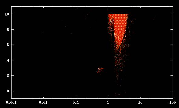
Most of our visitors have seen the scatter graph from the Seti at Home web site (Example 1). This graph shows the distribution of gaussians detected by the Seti at Home program that are plotted according to peak power and chi square. One little known Seti fact is that the term "chi square" is actually an abbreviation for "chimera" a term that originally meant a frightful or foolish fantasy but has been adopted by the Seti at Home program as a term that expresses how well the gaussian curve fits the data .
 |
EXAMPLE 1
Many of the Clinic visitors want to know what this graph means. According to the web site, the most interesting candidate signals show up in the lower right corner of the graph but there don't appear to be many signals in that corner. What does this say about the results of the program so far? Will we continue to find interesting signals in the future and if so, where will they come from and how will they compare to the results that we have found so far?
The Clinic has run all available information through our giant computer, using a complicated probability program, to find out what these points will look like projected twenty years into the future. We have put together a computer enhanced animated graphic that shows how the projected future results will compare to the present results.
To view the Clinic animation, click the button on the right.
![]()